Introduction
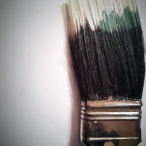
Color contrast is an important concept in art that refers to the juxtaposition of different colors and their intensities. It is a powerful tool that can be used to create visual interest and impact in artwork. By combining different colors, it is possible to bring a painting or drawing to life and add a unique dynamic to the piece.
In this guide, we will discuss the basics of color contrast, including the elements of color contrast, types of color contrast, and how to choose the right color scheme for artwork. We will also look at the benefits of using color contrast, how to break down different color combinations, and tips and tricks for enhancing artwork with color contrast. Finally, we will wrap up by looking at examples of artwork that utilize color contrast effectively.
Characteristics of Color Contrast
Color contrast is an important visual tool to create impact in artwork. It involves contrasts in lightness, saturation, hue, and brightness. In artwork, colors work together to create a visual effect. This effect can range from creating balance to evoking emotion.
When it comes to color contrast there are two key elements, the contrasting colors, and the way they interact with each other. Colors such as black and white, yellow and blue, red and green, are all prominent examples of color contrasts. The way these color contrasts interact with each other can have a drastic effect on the artwork, and this is where the artist can become creative and play around with the design.
Types of Color Contrast
Color contrast is an essential part of creating visual impact in artwork. The different types of color contrast allow the artist to create a variety of looks and feelings through their artwork.
The first type of color contrast is called complementary colors, which are colors that are opposite of each other on the color wheel, like blue and orange. This type of contrast can be used to add vibrancy to artwork. It brings out the vibrancy of both colors and creates a more dynamic look.
The second type of color contrast is called analogous colors, which are colors that are next to each other on the color wheel, like blue, green, and yellow. This type of contrast can be used to create a softer, more harmonious image.
The third type of color contrast is called monochromatic colors, which are shades of the same color, like blue and navy blue. This type of contrast adds depth and dimension to artwork, as it creates subtle variations of the same color.
A fourth type of color contrast is called triad colors, which are three colors that are equidistant from each other on the color wheel, like blue, yellow, and red. This type of contrast can be used to add vibrancy and energy to artwork.
Finally, there is tonal contrast, which is the balance between light and dark colors. This type of contrast can be used to create dramatic effects and create shadows in artwork.
No matter what color contrast you choose to use, it is important to consider how the colors interact with each other to create the desired effect. With the right color choices, you can create artwork that stands out and makes a statement.
Step-by-Step Guide to Implementing Color Contrast
Using color contrast in your artwork can make a huge impact and create a stunning visual. But how do you implement color contrast effectively? This step-by-step guide will help you get started with creating a great artwork with color contrast.
Examples of Color Contrast Combinations
Start by thinking about the colors you would like to use for your artwork. Consider the overall look you’d like to achieve, and then pick a few colors you want to work with. You can choose from any color wheel or palette to find the best color combination. After selecting the colors, try experimenting with different combinations. Here are some popular color contrast combinations:
- High Contrast: colors from opposite sides of the color wheel, such as blue and orange.
- Low Contrast: colors close together on the color wheel, such as blue and green.
- Neutral Colors: colors like black, gray, white, and brown.
- Bright Colors: colors such as red, yellow, and orange that are bold and eye-catching.
How To Use Color Contrast in Artwork
Once you have chosen the colors you want to work with, you can start implementing color contrast in your artwork. There are several ways to use color contrast to create impact. Here are a few tips you should consider:
- Use complementary colors (opposite colors on the color wheel) to create a high-contrast look.
- For a subtle effect, use colors that are close together on the color wheel.
- Take advantage of the power of neutral colors – they can act as a bridge between two strong colors.
- Incorporate bright colors to make a statement and add drama to your artwork.
By using these tips, you can create stunning artwork with color contrast. Have fun experimenting with the different color combinations until you find the one that works best for you!
Benefits of Color Contrast
Color contrast helps to draw the eye to certain elements in artwork, making certain areas stand out and be noticed more easily. It can also be used to create a sense of balance and harmony in artwork, and can be used to emphasize certain color combinations or themes. Color contrast can help to create depth and dimension in artwork and also can be used to create a more visual impact than a single color.
Using color contrast has many benefits, including making artwork appear more vibrant and alive. It’s also a great way to add depth and texture to artwork, which can make it even more visually appealing. Color contrast can also help to create a sense of balance in artwork, as different colors can be used to emphasize certain themes or ideas. Lastly, using color contrast can help artists to create artwork that captures the viewer’s attention and sparks their interest.
Choosing the Right Color Scheme for Your Artwork
Knowing how to choose the right color scheme for your artwork can be essential in creating impactful art. Here are some tips to help you select colors for your artwork:
- Consider what emotion or message you want to convey with your artwork. Choosing colors that reflect this emotion or message is key to producing powerful art that resonates with viewers.
- Think about the colors that go together well; inspect combinations of colors that will create the desired effect.
- Study the color wheel and learn how to use complimentary, analogous, and monochromatic colors to create artwork with a cohesive look.
- Get creative with your color choices by experimenting with shades, tones and tints of colors.
- Choose colors that complement the environment in which the artwork will be displayed.
By following these steps, you will be able to choose the right color scheme for your artwork and make a statement with your art!
Breaking Down Different Color Combinations
Color combinations are the crux of excellent artwork. In this section, we’ll break down the importance of color combinations and how they can be used to achieve an impactful outcome.
Color combinations come in two forms: complementary and analogous. Complementary colors are two colors that are opposite each other on the color wheel and create a visually appealing contrast when paired together. Analogous colors are three or more hues that are close together on the color wheel and usually create a pleasing tranquil feel.
To create an impactful outcome, color combinations should be carefully chosen. You don’t have to stick to a strict palette but it’s important to consider how the colors will interact with one another. Additionally, the same color may need to be used at different luminosity or saturation levels to create a visually pleasing work of art.
It’s also important to note that in some cases, adding a contrasting accent color can make a piece stand out. The size and placement of the accent color should be balanced and carefully chosen.
Using different types of colors to create a unique artwork can be difficult, but with thoughtful planning and an understanding of color combinations, you can easily create a stunning piece of art.
Working with Monochromatic Colors
Monochrome colors are single color shades that can be combined to create vivid and colorful artwork. For example, if you use different shades of blue, like baby blue and navy blue, you can create an interesting contrast between the two shades. By overlapping a light blue over a dark blue, you can create beautiful pieces of artwork that contain multiple colors without having to use multiple tones.
If you want to use monochromatic colors to achieve desired color contrasts, it is important to select colors on the same value range. This means that the colors should have a similar shade or tint, just different hues. For instance, if you choose yellow and orange as your base colors, make sure that they have the same depth, just different hue values.
By experimenting with various combinations of monochromatic colors, you can easily find the right color contrast combination for your artwork. You can also try mixing different textures of the same color to give your artwork more depth. Once you understand how to work with different colors, you can create artwork that is both visually pleasing and impactful.
Utilizing Color Contrast Principles
Color contrast is a key element in creating visually striking artwork. Color contrast can be used to draw the viewers eye to certain parts of the artwork and create a sense of balance. In this section, we will explore how to use color contrast principles to create impactful artwork.
The first step when using color contrast in artwork is understanding the two main types of color contrast. The first is high contrast, where colors that are opposite each other on the color wheel are used together. The second type is low contrast, where colors that are similar in hue are used together. Using both of these types of contrast can create a more interesting and dynamic visual.
The next step when implementing color contrast in artwork is understanding the different techniques you can use to draw attention or create focus. For instance, you can use bright colors combined with dark colors to create a focal point. You can also use a monochromatic color scheme to create a subtle but effective contrast. Finally, you can use tints and shades to help create a desired effect.
Once you have a better understanding of the different types of color contrast and techniques, you can start applying them to your artwork. It is important to experiment with different combinations to find out what works best for you and your art. With practice, you will be able to find the perfect combination of colors to create a truly impactful artwork.
Tips and Tricks for Enhancing Artwork with Color Contrast
Color contrast can be a powerful tool to create visually appealing artwork. By using the principles of color contrast, you can make your art more dynamic and interesting. Here are some tips and tricks to help you maximize the impact of your artwork:
- Choose two or three strong colors and use variations of those colors throughout your artwork.
- Use light and dark shades of the same color to create interesting depth in your artwork.
- Avoid having too many different colors, or your artwork can end up looking busier than it needs to be.
- It is important to ensure that there is sufficient contrast between colors, so that they stand out and grab attention.
- Using the same colors but in different hues can also be a great way to add interest to your artwork.
- Combining complementary colors can create a vibrant, eye-catching look to your artwork.
By using these tips and tricks, you can take your artwork to the next level and create impactful works of art!
Examples of Artwork Utilizing Color Contrast Effectively
Color contrast can be used to create stunning pieces of artwork. There are a variety of ways to use color contrast, and it has been used by artists since the beginning of art. We have compiled some of the best example artwork that demonstrate how effective color contrast can be.
- Van Gogh’s The Starry Night – The swirling night sky of the painting contains a range of blues and purples all in different shades. This creates a beautiful contrast between the bright stars and the deep hues of the nighttime sky.
- Picasso’s The Weeping Woman – The vivid yellow background drastically juxtaposes the cool blues and strong greys of the woman’s clothing and face. This high level of contrast makes her stand out against the background of the painting.
- Monet’s Water Lilies – Monet’s painting is a classic example of contrast between light and dark colors. The blues of the background fade seamlessly into the deep greens of the lily pads. He also uses lighter green tones for the vivid lily flowers.
By using color contrast, these classic paintings have become iconic. Color contrast is an effective tool to create impactful artwork that stands out from the rest.
Conclusion
Using color contrast in artwork can produce visually stunning results that have the power to capture an audience’s attention. Color contrast is a great way to emphasize particular elements of your artwork and create a dynamic composition. When used correctly, color contrast can help make artwork more visually appealing and create an impactful statement.
In this guide, we discussed what color contrast is, the types of color contrast, how to use it effectively in artwork, and examples of good color contrast uses. We also went over the benefits of using color contrast, how to properly choose the right color scheme, and tips and tricks for enhancing artwork with color contrast.
Color contrast will continue to be a popular choice when it comes to creating vibrant, eye-catching artwork. By following the steps we outlined in this guide, you will be able to effectively use color contrast to create artwork that stands out from the rest.
comments: 0