Introduction: What is Color Theory?
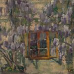
Color theory is the study of how colors work together and how they can be used to create art. It is used by artists, designers, and photographers to create aesthetically pleasing pieces. Color theory involves the understanding of hue, saturation, lightness, and intensity of a color, and how these attributes interact with each other. It also involves learning about how different combinations of colors combined into a single palette can evoke different emotions or feelings in viewers.
The basic idea behind color theory is that certain colors can create harmony when used together in a piece of art. When colors are chosen that complement each other, their effect is more powerful than if they were used alone. Color theory can be used to express ideas or create certain moods when creating art.
Primary Colours in Color Theory
Primary colours play a major role in art and design. They are the most basic, purest forms of colour and each one can be used to create the other colours we see in artworks. The three primary colours are red, blue and yellow. A combination of these three colours is used to create all the other colours.
Primary colours cannot be created from any other colour. They are said to be fundamental colours because they cannot be changed by mixing other colours. When two primary colours are mixed together, it creates a secondary colour. When all three primary colours are mixed together, they create a neutral or “grey” colour.
When thinking about how primary colours can be used to create artwork, it is important to consider the basic colour wheel. The colour wheel is split into the three primary colours (red, blue and yellow) as well as their secondary colours (orange, green and purple). These six colours are arranged within the wheel to illustrate how they can be combined to create other colours.
The primary colours can also be used to create complementary colours. These are colours that are found opposite of each other on the colour wheel. Examples of complementary colours are red and green, blue and orange, and yellow and purple. When these colours are placed near each other, they tend to create a striking contrast.
Secondary and Tertiary Colors
Secondary colors, as the name implies, are created when two primary colors are combined. For example, combining yellow and red makes orange, a secondary color. Mixing green and blue makes teal, mixing red and blue makes purple. All of these are considered secondary colors.
Tertiary colors are the result of mixing a primary and secondary color, together. Examples are yellow-orange, blue-green, red-violet, and so on. In many color wheel designs, tertiary colors are labeled in some way, however it is not uncommon to simply recognize them by their hue.
The tertiary color wheel includes all twelve hues, as the number of possible combinations grows exponentially with each tone. That means that there are now 24 distinct tertiary colors.
By understanding which colors are primary and which are secondary and tertiary, you can start to understand the dynamic relationship between colors on the color wheel. You can also gain insight into how any combination of colors will work together.
Complementary Colours
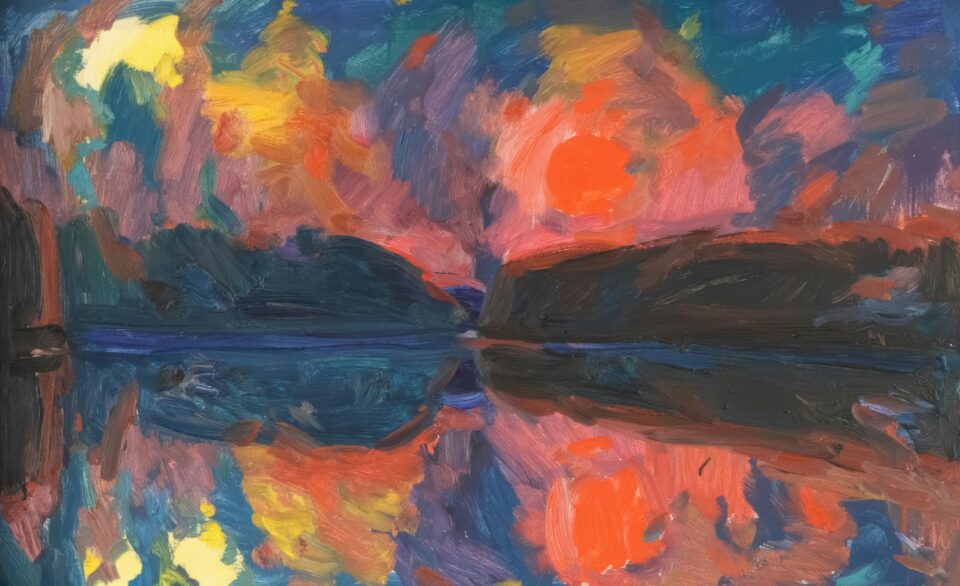
When an artist is looking at the basics of color theory, complementary colors are one of the main concepts to consider. Complementary colors are colors that are opposite each other on the color wheel, and can form a vivid contrast when working with art. When we look at the color wheel, the complementary colors appear in pairs: red/green, orange/blue, and yellow/purple. Knowing the complementary colors can help you create vibrant images with a lot of contrast. Think about the sun setting over a grass-covered field – the oranges and blues work together, creating a stunning image.
For example, when combining red and green, an artist can create a more lively and powerful composition. Often times, complementary colors create a more balanced piece than just sticking to one color. Furthermore, when used correctly, complimentary colors draw attention to the artwork and can leave quite an impression on the viewer.
Complementary colors are also useful for creating a sense of depth and adding emphasis to certain areas in artwork. By using variations of the complementary colors, such as light blue and dark green or dark red and light yellow, an artist can create depth and perspective within their work. Complementary colors can also be used to bring different elements of the artwork together. For example, a red flower next to a green leaf can unify the two elements in the artwork.
Overall, complementary colors can have a significant impact on artwork and can bring an interesting and beautiful contrast to it. As in any form of art, understanding the basics of colour theory is key. Complementary colors are an essential part of this concept, and by using them together, an artist can create beautiful pieces that will make an impact.
Warm vs Cool Colors
In color theory, warm colors are the hues that show up in yellow, red, and orange families on the color wheel. These colors are known to evoke feelings of energy, comfort, and joy with their vibrant and lively vibes. On the other hand, cool colors, which include blue, green, and purple families, are the colors that evoke feelings of calm, quiet, and relaxation.
When creating a piece of art, understanding the power of warm and cool colors is crucial. Picking the right mixture of colors can help you create the desired mood in your artwork. For instance, if you want your work to convey energy and excitement, warmer colors tend to be more effective than cool colors. On the flip side, for an artwork intended to invoke feelings of peace and tranquility, cool colors tend to work better.
It is important to note that the placement of colors also affects how our minds respond to the artwork. For example, warm colors placed at the forefront of an image will draw attention while cool colors placed in the background could make the foreground colors look brighter and improve the contrast of the artwork.
Analogous Colors
Analogous colors are any three colors that are side-by-side on the color wheel. Analogous colors often have a gentle, harmonious quality. They are great for creating a sense of serenity and visual flow. To use analogous colors, pick a base color, then choose two to three shades of that color (lighter and darker tones) to create a stunning color palette.
An analogous color scheme consists of three colors that are next to each other on the color wheel. An example of this would be yellow, yellow-orange, and orange. These colors all share a common hue or undertone, which makes them appear more unified and related.
Examples of Analogous Colors
- Red, red-orange, and orange
- Blue, blue-green, and green
- Purple, blue-violet, and violet
- Yellow, yellow-green, and green
When using analogous colors, you should make sure to vary the values of your colors (light and dark). This will ensure that the colors will appear balanced and interesting. You can also add a neutral color (like black, white, or gray) to further add depth to your design.
Shades, Tints, and Tone
When discussing color in art, it’s important to know the differences between shades, tints, and tone. Shades are colors that are dark, usually created from adding black to the original hue. Tints are colors that are light, usually created from adding white to the original hue. Tone is a term used to describe when gray is added to a hue, creating a muted or desaturated color.
Shading can be used to create depth and shadows in artwork. Tinting is often used to soften the look of a piece, or to make something recede into the background. Tone can be used to give an old-world charm or to draw focus to a particular area.
All of these techniques have been used for centuries to give artwork unique depth and texture. The study of color theory allows an artist to create appealing works of art that draw the viewer in with their color choices.
Using Color Psychology in Art
Color theory can be a powerful tool when used to create art that evokes emotion from its audience. By using color psychology, you can use certain colors to create different moods, thoughts, and messages to the viewer.
For example, warm colors, such as yellow, orange, and red are often used to evoke energetic emotions. These colors are associated with joy, excitement, and enthusiasm, and can be used to create a piece of art that communicates happiness or passion. On the other hand, cool colors, such as blue, green, and purple, are more calming and give a sense of serenity. They are often related to calmness, peace, and relaxation.
Colors can also be used to invoke different psychological responses. For example, black is often seen as a color of sophistication, while white can represent purity and innocence. Red can signify danger and intensity, while green is often associated with nature and growth. Understanding how these colors can be interpreted by viewers can be a powerful tool when creating an artwork.
It is important to note that color psychology is subjective, as different people can perceive the same color differently. Therefore, it is important to consider the audience when using color psychology in art, as this can help to ensure the artwork conveys the desired message accurately.
Finally, while color psychology can be a powerful tool for art, it should not be the only factor when creating a piece of art. Balance is key, as art should combine multiple elements such as color, form, line, texture, and composition, to create a complete and meaningful piece.
Monochrome Colors
Monochrome colors are colors that exist within the same color family and have minimal if any variation. They have the same “hue”—just different shades, tints, or tones. Monochrome colors create visual consistency, so they can be used to establish a color palette in an artwork. The monochrome artist typically chooses his or her primary color for the palette and then creates variations of the original optimized for different effects.
For example, black, gray, and white could be used together to create emphasis on one specific area of an artwork. The presence of only shades of one color makes the artwork look more unified and aesthetically pleasing. Monochromatic pieces are also great for making a statement with texture and contrast by using various layers.
These colors can be used to give a classic or antique feel to a work. Monochrome colors don’t have to be dull either; bright colors like pinks and oranges can be used in this color scheme to create interesting art. Additionally, using multiple shades of one primary color can be a great way to set-up a background for your artwork.
Bold Colors
Bold colors are used to create a striking visual in art. Often they are used to draw the eye of the viewer to an important part of the piece. Bold colors are strong and powerful and can create an emotional response from the viewer. They tend to be primary colors or bright secondary colors like oranges, purples, and greens.
The use of bold colors can make a statement and convey a message. Depending on the colors you choose, you can give your art work an uplifting and cheerful feel, or a more somber and serious tone. Using multiple bold colors together can sometimes create a chaotic look, as the eye tries to take in all the different hues and tones being displayed.
Bold colors can be intimidating for some artists to use. It’s important to use them judiciously and to not overuse. Try to balance your art work with some softer colors. This will create a contrast and will help bring out the bolder colors.
Color Mixing
Color mixing is a key element in the basics of color theory and an essential skill for any artist. Color mixing involves blending two or more colors together to create an entirely new hue. This can be done with either physical paint, or digitally on programs such as Photoshop or Adobe Illustrator.
Two main techniques are available when it comes to mixing colors—subtractive and additive color mixing. With subtractive color mixing, the color is removed from white light using filters, pigments, or dyes. Meanwhile, additive color mixing includes adding various wavelengths of colored light together to find a desired color. This technique is often used with digital editing.
Mixing colors is a trial and error process for most artists, however, there are also useful tools that can help you find the perfect combinations. Color wheels are a great visual guide, however if you’re looking for something a bit more precise, color pickers can help you find the exact shade you’re looking for.
As a beginner artist, practice mixing colors and analyzing different color combinations will help you become a pro in no time.
Conclusion
We hope you’ve enjoyed learning the basics of color theory in art. To summarize, we’ve discussed the primary colors, as well as secondary and tertiary colors. We’ve also explored complementary colors, warm vs cool colors, analogous colors, shades, tints, and tone. Additionally, we’ve looked at color psychology in art, monochrome colors, bold colors, and color mixing.
We hope that with this guide others can understand the power of color and how to use it effectively in their artwork. Color theory is an integral part of creating beautiful pieces. It takes practice and experimentation, but soon you’ll be an expert yourself.
comments: 0