Introduction to Color Mixing and Color Theory in Painting
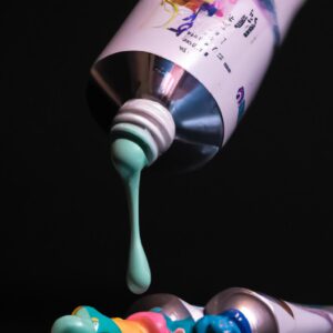
Painting is a beautiful way of expressing yourself and your creativity. Color mixing and understanding color theory can be a great way to help improve your painting skills. Color theory helps us understand how the colors mix and interact with each other, as well as how light affects them. Knowing this helps you create the desired effect in your painting.
This guide will provide you with a basic knowledge of color mixing and color theory that you can use to improve your painting. We will cover the basics of color wheel, color groups, how to harmonize colors, color schemes, tints, shades, tones, intensity, contrast, warm and cool colors, complementary colors, and analogous colors.
How Colors Interact & How Light Affects Color
Colors interact with each other to create different effects and qualities. To help explain this, let’s look at how light affects color. The amount of light and the angle at which light reflects off of a surface can create different colors in our painting. For example, when light hits a blue surface at a low angle, it may appear to have an orange tint.
Colors also change when they are mixed together. Red mixed with yellow to create orange, green mixed with yellow to create lime, blue with red to create violet – these are all examples of how colors interact with each other to form something new.
Color mixing and how light affects color is important when painting because it helps us understand how to create the right color combination, the right hue, and the right effect. It helps us create more interesting and dynamic paintings.
Introduction to the Color Wheel
Understanding the color wheel is essential to understanding color mixing and color theory. The color wheel is a visual representation of the relationships between colors and how they interact with each other. It is based on the three primary colors – red, blue, and yellow – and the combinations of those colors used to create all the other colors.
The color wheel is made up of twelve sections, or wedges, arranged in a circle to represent all the possible hues of color. Each of these sections is referred to as a hue, and it is comprised of three parts: the primary hue, its complement, and the two secondary hues that lie between them.
Each of the hues on the color wheel are related to each other in either a complementary or analogous relationship. Complementary colors are located directly across from each other; for example, red and green or blue and orange. Analogous colors are located next to each other in the spectrum; for example, red, orange, and yellow.
It is important to understand how the different hues interact with each other when mixing paints for art projects. By understanding the nuances of the color wheel, artists are able to make informed choices about their color palette and create vibrant works of art.
Basic Color Groups and Interactions
Painters often talk about the three primary colors, which are red, yellow, and blue. All other colors are created by combining different amounts of these primary colors. As you experiment with mixing colors, it helps to understand how these colors interact with each other.
You may have heard the phrase “opposites attract.” When working with color, this phrase is especially true. Complimentary colors are opposites, and when put together, they make a visually-pleasing combination. Red is opposite from green, yellow is opposite from purple, and blue is opposite from orange. When you place these colors side-by-side, the contrast between them creates beautiful visuals.
The main goal when working with basic color groups is balance. Too much of one color or too much contrast can be overwhelming, so it’s important to use the right combination of colors. Achieving balance in your paintings will help to create an appealing design that will draw the viewer in.
Color Harmonizing Using the Color Wheel
The color wheel is a tool used to aid in understanding how colors interact and how they can be used together in various ways. It is made up of 12 sections, each containing a primary, secondary, and tertiary color. By looking at the color wheel, it is easier to visualize how different colors relate to each other and how they combine to create harmonious palettes.
There are three basic ways to harmonize colors on the color wheel: complementary, analogous, and triadic. Complementary colors are those that are opposite each other on the wheel (such as blue and orange). Analogous colors are adjacent to each other (such as yellow and green). Finally, triadic color schemes are made up of colors that are equally spaced around the wheel (such as red, yellow, and blue).
Each of these three methods can result in beautiful color combinations that you can use in your painting. Experiment with different combinations on the color wheel to find the perfect combination for your needs.
Different Color Schemes
Understanding the different types of color schemes is an important part of understanding color mixing and color theory in painting. There are several popular color schemes that you can use to create beautiful works of art.
The most commonly used color scheme is the monochromatic color scheme which uses one color in different shades and tints. For example, a painting could be all yellow but have light yellows and dark yellows in it.
An analogous color scheme uses colors that are next to each other on the color wheel such as yellow, yellow-orange, and orange. This type of color scheme can create a very harmonious and pleasing effect in your painting.
A complementary color scheme uses two colors that are opposite each other on the color wheel such as red and green. This combination can create a beautiful contrast and depth in your painting.
Finally, a triadic color scheme uses three colors that are evenly spaced around the color wheel and can be used to create vibrant and exciting works of art.
Tints, Shades and Tone
In painting, you can mix in different amounts of white or black to make a variety of tints and shades. This is known as tonal variations. When white is added to a color, the result is a tint. When black is added, the result is a shade. Tints are lighter versions of the original color and shades are darker versions. The intensity of colors can also be adjusted with tone.
When mixing tone, you adjust the overall values and darkness or lightness of the colors. The tone of colors can be adjusted by adding gray to the colors. Gray is created when equal amounts of black and white are mixed. Adding gray to colors affects the overall brightness of the color. It’s important to note that the more gray you mix in, the less vibrant the color will appear.
Intensity and Contrast
When creating a painting, it is important to understand intensity and contrast. Intensity is the brightness or dullness of a color, whereas contrast is how different two colors are from one another. Increasing the intensity or contrast between two colors can create stronger visual effects.
To increase intensity, you can mix two primary colors together (such as red and blue) to make a vibrant secondary color (like purple). To decrease intensity, you can mix a color with its complementary color (such as yellow and purple). To increase contrast, choose two colors that are on opposite sides of the color wheel (like orange and blue). To decrease contrast, choose colors that are close together on the wheel (like pink and peach).
Experimenting with different intensities and contrasts can help you create the desired effect on your painting. It’s important to remember that these principles can be used to create both subtle and dramatic effects depending on the colors used.
Warm and Cool Colors
When it comes to painting, two of the most important color groups are warm and cool colors. Warm colors are made up of reds, oranges, and yellows. These colors can be used to create a sense of energy, warmth, and passion. Cool colors include blues, purples, and greens. These colors can create a sense of calm, tranquility, and peacefulness.
It is important to note that any color can be made cooler or warmer. To cool off a color, one must add blue to it. To warm up a color, one must add yellow, red or orange to it.
Complementary Colors
Complementary colors are opposite each other on the color wheel. When combined, they create a contrast that is often vibrant and eye-catching. The combination of complementary colors creates a variety of optical effects by emphasizing contrast between the two colors. Examples of complementary colors include yellow and purple, orange and blue, and red and green.
The best way to understand how complementary colors work is by experimenting with different combinations. You can mix complementary paint colors together to create new shades. You can also use complementary colors in artwork or design projects for an interesting effect with dynamic contrast.
- Yellow and purple are complementary colors
- Orange and blue are complementary colors
- Red and green are complementary colors
Using complementary colors in your work can be a great way to create drama and contrast in your paintings or projects. Be sure to experiment with different combinations of complementary colors until you find the right look for your work.
Analogous Colors
Analogous colors are colors that are next to each other on the color wheel. For example, the analogous colors of orange are yellow-orange and red-orange. Analogous colors create a harmonious look when used together in a painting. They provide depth and interest to a composition. If you look closely at nature or artwork, you will see evidence of analogous color harmonies everywhere.
When using analogous colors, try to balance the color temperatures (hues) by using a little bit of warm colors and a little bit of cool colors. You can also create interest in your painting by adding a complementary color into the mix. This will help to create contrast and lead the viewer’s eye around the painting.
Introduction to Color Mixing and Color Theory in Painting
Learning to mix colors and understand color theory is an important part of painting. Color is a complex and fascinating subject that can have endless possibilities. Understanding how colors interact with each other and how different amounts of light affect them, will help guide you to successful outcomes when creating your art.
How Colors Interact & How Light Affects Color
Colors interact with each other by the process of absorption and reflection. Any color can be created from mixing two or more colors together. When light hits an object, some of the light is reflected back and that’s what our eyes see as color.
Introduction to the Color Wheel
A color wheel is a great tool to help teach yourself about color. The traditional color wheel consists of 12 sections, which are divided into three groups of colors: primary, secondary and tertiary.
Basic Color Groups and Interactions
The primary colors are Red, Blue and Yellow. These colors cannot be created by mixing any other colors together. They are the basis for all other colors. Secondary colors come from combining two of the primary colors together such as blue and yellow. They are Green, Purple and Orange. Tertiary colors are produced by mixing equal parts of a primary and a secondary color together.
Color Harmonizing Using the Color Wheel
When using the color wheel to harmonize colors, you will look to see which colors sit opposite or next to each other. Colors that are opposite each other on the color wheel are considered complementary colors. If you choose two colors that are side by side, they are called analogous colors.
Different Color Schemes
Monochromatic – This color scheme uses variations of one color with tints and shades.
Analogous – Analogous colors are similar in hue and appear next to each other on the color wheel.
Complementary – Complementary colors are opposite each other on the color wheel and create a strong contrast when used together.
Triadic – A triadic color scheme involves three colors that are evenly spaced around the color wheel.
Tints, Shades and Tones
- A tint is created by adding white to a color.
- A shade is created by adding black to a color.
- A tone is created by adding gray to a color.
Intensity and Contrast
Intensity and contrast refer to the brightness and dullness of a color. Intensity is how strong or weak a color is. Contrast is the difference between two colors when placed side by side.
Warm and Cool Colors
Warm colors are those tones that evoke feelings of warmth and comfort, like red, yellow and orange. Cool colors are those hues that evoke feelings of calmness and relaxation, like blue, green and purple.
Complementary Colors
Complementary colors are those that are opposite each other on the color wheel. For example, purple and yellow are complimentary colors. They create a strong contrast and when mixed together will become a neutral brown.
Analogous Colors
Analogous colors are similar in hue and are found next to each other on the color wheel. For example, blue, blue-green and green are analogous colors. They create a harmonious combination that is pleasing to the eye.
Conclusion with Summary
Understanding color mixing and color theory in painting can be daunting but also rewarding. With practice and knowledge, you can start to build your own color stories. Choosing which colors will work well together and understanding why certain color combinations look better than others, will help you to create beautiful works of art.
comments: 0